
sponsored review
About seventeen friends and I were sitting around the patio at Theo’s a week or so ago and we started planning our next happy hour get-together. Suggestions rang out from right-to-left. “Let’s come back to Theo’s. We’ve got to go to James at the Mill. How about that new Mexican place by Zaxbys? I know, Bonefish, oh wait, nah, Bonefish is way too cramped and closed in…”
Bonefish, cramped?
Not any more.
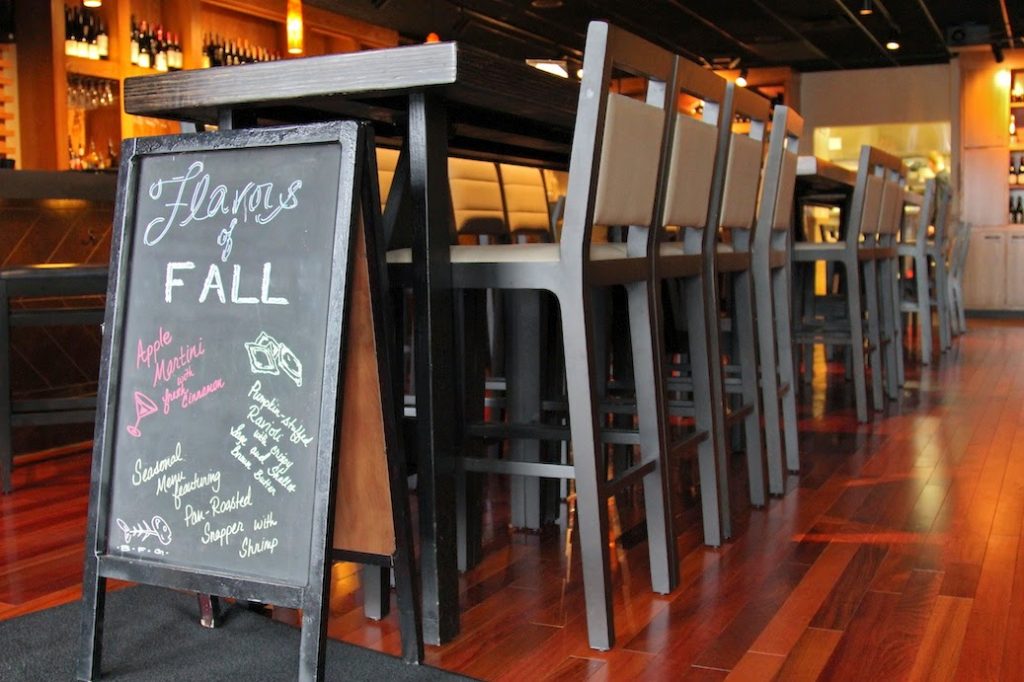
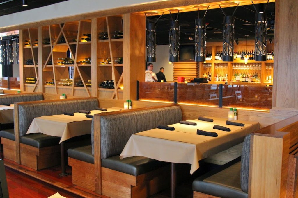
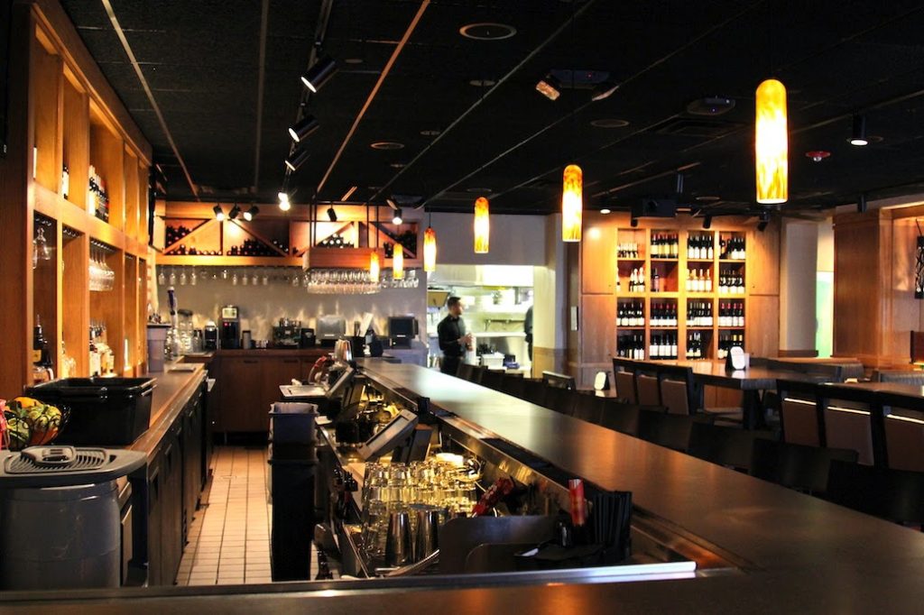
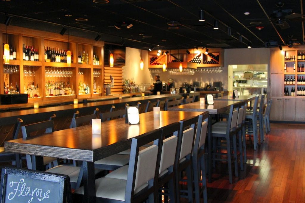
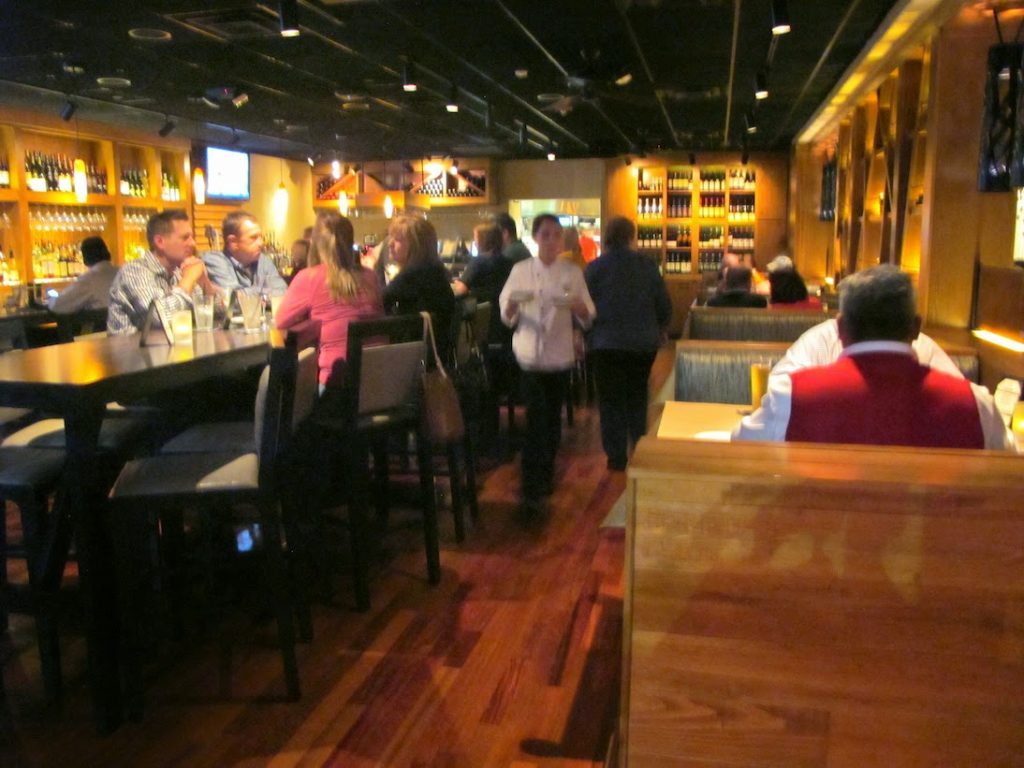
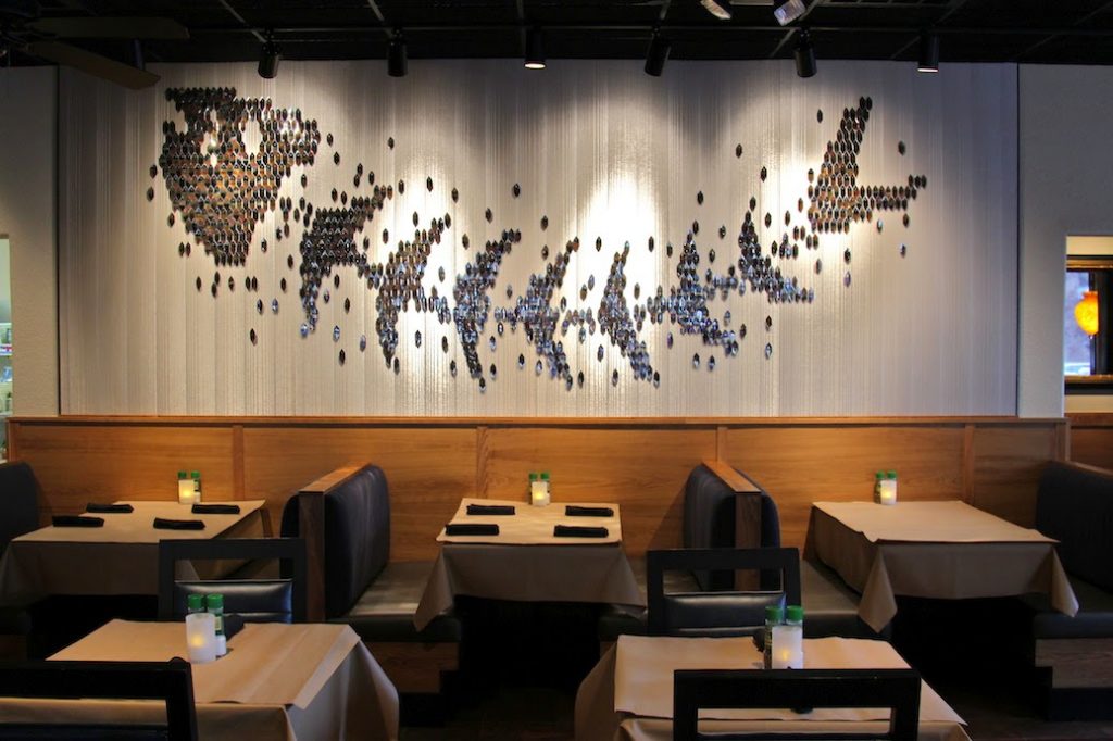
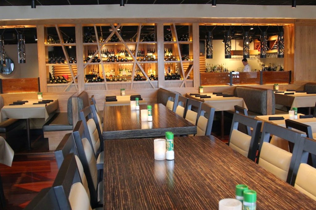
Bonefish in Rogers just completed a refresh to their interior décor, which opened things up quite a bit. After my friend’s comment, I realized that I, too, wasn’t crazy about how cramped it felt once you walk through the revolving door. Inadvertently, I think I stopped going there for that very reason. In spite of that, I love fish, they have a strong gluten-free menu, and who doesn’t love a place that serves healthy choices like edamame on the menu? It was way past time for a revisit.
I really dig the new look.
It’s very clean and fresh. They removed that huge barrier of a wall between the lounge and the dining room and designed it more as a see-through art extension of wood and wine. Two mediums that I personally think go great together! Ha!
At the end of the day, I think Bonefish really needed the reboot.
It fits them well and I will definitely be back for dinner and lunch.
Oh, and for happy hour.





So glad to hear this. We have always felt so cramped at Bonefish — rather like we were sitting in the laps of the people at the next table. Happy girl!
I remember when they first opened and Dennis and I went. There was one random table in the middle of the main walk zone. Guess where we sat? Yep. So glad they got rid of that table. 🙂